


This museum-wide exhibition centered around the women and femmes who were intertwined with Andy Warhol’s life and career.
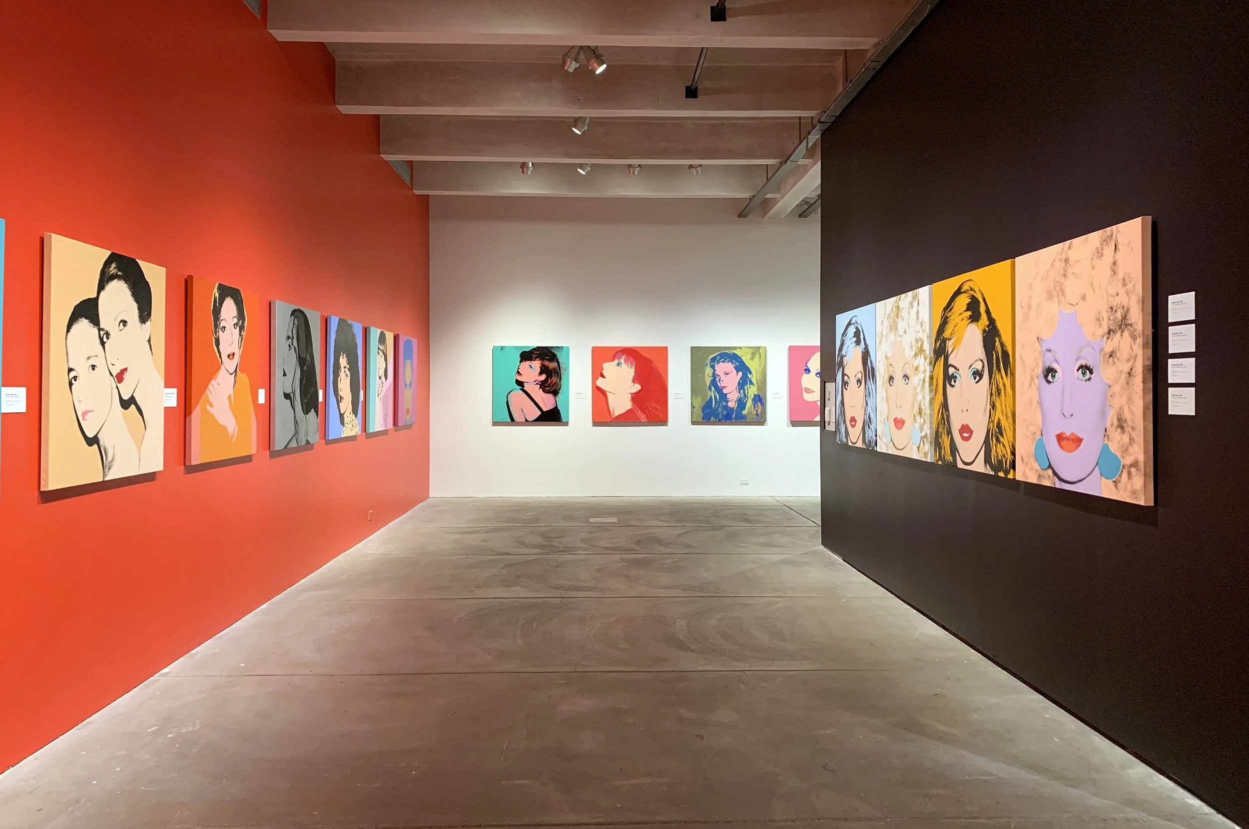
I worked closely with chief curator José Diaz to establish a look and feel for the show. The challenge was to create a cohesive aesthetic that could extend through all seven floors, serving as a visual guide for the visitor while still leaving space for the permanent collection to shine. Choosing a strong coral color and adding wayfinding allowed the visitor to immediately associate that visual cue with the show, encouraging them to explore at their leisure and create a connection between works.
The wordmark came to life in neon, used to bookend the visitor’s journey on the seventh and second floor.
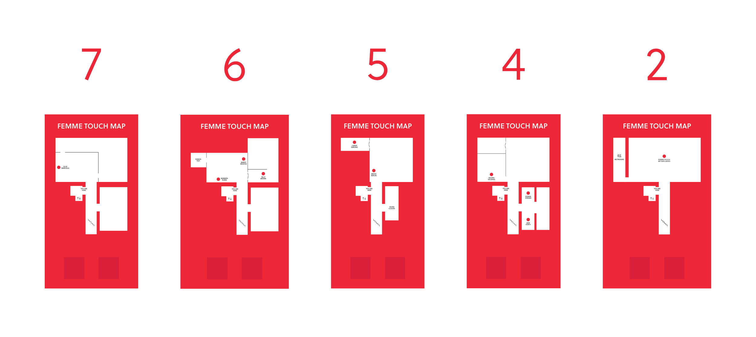
To further anchor visitors on their journey and connect them to the show, I created custom maps to identify key landmarks, current location, and the femmes available for exploration. The exhibit guide was available for pickup here.
Each femme was identified using the exhibit font, training the visitor to associate individual exhibits spread through the museum with the overarching exhibition.
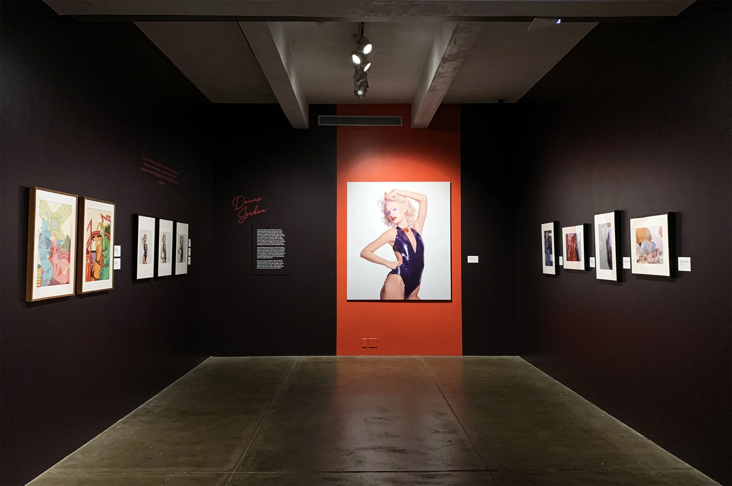
Tombstone labels were produced to match the wall color and mounted to a thin substrate for subtle texture.
Photo blowups were printed on foamcore and mounted on a contrasting color for extra emphasis, further encouraging connections across floors through repetition of design elements.